If your graph has 2 columns with numeric data and looks like below chart.
The above chart is difficult to analyze, because the scale of the Transactions is much larger than the scale of the Units Sold. As a result, we can barely read the Units Sold series and can’t gain any useful insight from the virtually indistinguishable columns. The Total Transactions should be moved to a secondary axis, allowing the series to be scaled differently.
STEP 1: Select the data series you wish to place on the secondary axis. In this case it’s the “Total Transactions” series.
STEP 2: Navigate to the Format or Layout tab if you’re not already there. (If you chose Option 2 in selecting the data series, you’re already there). Now, in the “Current Selection” section at the far left, make sure the dropdown selection reads “Series ‘Total Transactions’” and then click “Format Selection” (right below the dropdown).
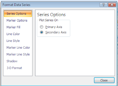
 STEP 3: Clicking Format Selection with the series selected will bring up the Formatting dialog. It will open to the Series Options tab with Primary Axis selected. Click the “Secondary Axis” radio button and then click “Close”
  You’ve now successfully added a second axis to your chart.

Great post. I was searching for along time on some simple steps for adding secondary axis to chart and this post explains steps as how to work in excel and add a secondary axis. Worked for me.
ReplyDelete